Showing posts with label website designing company. Show all posts

Tuesday, August 23, 2016

Ways to Create a Web Design Process which is Smarter

Especially when you have that creative edge in you, you should fall again in love with the art of design. Reasons and factors may be different. One of it can be working too fast or too hard or working in non creative atmosphere contended with lot of resistance every day. Do not be a repetitive performer or get bore.

A process for design enables to innovate so that one can measure the depth of an idea for its implementation.

The process must be flexible and be such that it can be changed. Each process has its own drawbacks. A Web Design process must be adaptive to skills, resources and these real life limitations.


Following are some ways in which the design process can be improved:-

  1. Define the Issues
Most of the designers think that the issues are obvious. They are the caution for real problems. Search for new ways to tackle the issues. This approach before designing the product will ensure correct designing of the product.

      2. Know your User

If you think that your product is for everybody, it sounds reasonable but a mass market product cannot create meaningful use cases if you can’t specify your users. Meaningful use cases are important to know how minimum viable product needs to be and how to construct a strategic plan for the same. A great product is the one which solve handful of problems easily and simply in a way understandable by people who use it.

Anything through which you can get into the minds of the user deeper is an investment towards a successful design.


Picture Courtesy:-www.massimpressions.com

  3. Think Big Solutions to the Issues

Consider extreme solutions and go little deep with the ideas. Break the conventions and think beyond the usual. Think like a user and see where all the possibilities can turn to your favor. Think out of the box and focus on what inspires you. Take a break to connect with the issue to be solved. Seek inspiration beyond your field and you will find effective solutions and creative as well.

Picture Courtesy:-www.cdn-media-2.lifehack.org

 4. Develop Hypothesis and Test It

Hypothesis is a way to find truth. Each design has a basis strong enough to build upon. Assume it to be a statement and its where your use cases for development work. Practice brainstorming whenever possible and explore with your team.

Picture Courtesy:-www.webfries.com

 5. Discuss and Come up Unanimously for Best Solution

A solid design calls for a discussion. A team with different experiences and can help coming up with better solutions. Consider all perspectives on the improvement of design. Work with design manager to make sure product team will have a final input.

Picture Courtesy:-www.blog.usertesting.com

  6. Build Story along with Documentation

Consider your personalities as the characters, use cases as parts of the play, wireframes as your stage and process & user flows as the choreographies. UI kit is the set design. Build a documentary which tells a story. Everything is related to each other. Design assets are pieces having little value individually but when put together, they build a picture.

If the documentation is not moving forward or if it isn’t usable, there will be no reason for creating it hence minimize those.

  7. Design and Test on Paper

This helps in informing design decisions. You get attached to a design when it starts converting to a pixel form. Fix a time period for your team to do sketching and prototyping on paper long with searching for possibilities. Start testing by conducting virtual walk through. Manage the flaws or gaps. 

Picture Courtesy:-www.99designs-blog.imgix.net

 8. Post-it on Wall

It might sound cliché, but when designing for specific users, UX and Web Designer needs to map the connection of an issue to them thereby linking it to the solution. Every team member includes it in their workflow.

Picture Courtesy:-www.c.fastcompany.net

 9.  Build lo-fi’s

It can be created with basic HTML, keynote or powerpoint, paper cut-outs, storyboards and specialized prototyping tools like UXPin. When it moves into development, some limitations you can avoid like compatibility with the browser and site performance. Test design before development, it helps in user stories and provide developers with rich insights.

10. Create with Collaboration

Pair coding reduces technical error and it is easy to be code blind. For better analysis and iteration, try coopers pair design technique. Working with others generates motivation and self improvement. You can have your projects the fun way and collaboratively.

Picture Courtesy:-www.cdn.lynda.com


Source Url:-

Friday, July 22, 2016

Reasons for Fading Essence of Web Design

The future of web development is responsive web design but somehow the magic is gone. It’s more of a casualty of boxes and grids wherever you see every time you open a new and amazing responsive web design.

For this to understand, we have to go back to the origin of responsive web design. Those were the times when websites like CSS Zen, K10K, etc. were the biggest source of inspiration for website design.


Lack of Creativity
It’s like because of responsive design, website design has lost its essence. Where does all the creativity gone after all? Earlier the website featured unique designs which were full of thoughtfulness at every turn. A soul would mean that a website should have intangible details of the design.

You must have seen sites which stand apart from the other sites. So, what are the factors which set them apart? Those who do not tell them apart are the ones who don’t have much knowledge about it, in opposition of those who love designs.

Image Courtesy:-netdna-cdn.com

Everyone hopes for such a website which can offer creative and great designs. You must have visited many sites which you were not impressed by. Several of those uses same design, look, color or layout that it becomes tough to tell them apart. Changes which have taken place in the past few years have left many wondering that the creativity has gone.

The focus of new websites has shifted to usage of responsive web design, a system which has extensive use of grids and boxes so as to load the pages automatically and adjust the screen size for a respective viewer. The concept is great though because it allows a website to look good and load better on devices like Smartphones and tabs as well as on computers but it has also taken the creativity and individuality which has gone into web design leaving the websites to look and feel the same.

Image Courtesy:-www.workbenchmarketing.net 

Stand out sites

Sites can stand above other sites due to responsive web design usage to an extent it is used today. You can find innovative and artistic designs if you want them. Only because responsive web design has become a fad today, doesn’t naturally mean you won’t find a designer which can add up layers to the prior work in order to provide you with the best on your website. It is more of a challenge for web designers to work within the framework to bring back some of the lost art into web design. But it can definitely be done by those who are willing to and ready for accepting this challenge.

Image Courtesy:-vincenzowebdesign.co.uk

Turn to a company which goes beyond standard Search Engine Optimization Company (such as web design CT co. or SEO Connecticut), if you are looking for innovation of this type on your website. They are going to take your ideas and run them which allow you to reclaim the type of great website design that people want today.

Source Url :-

Wednesday, July 13, 2016

Watch for these Web Design trends in 2016!!

Why is it significant for a company who is not a designer? Well, if one spend hours on writing a blog, wouldn’t it be best that you stand apart visually.

1. Usability
In 2016, design will be all about the users. UX (user experience) will be the new black indeed.  No one actually cares about your cool design looks if it’s not usable. Engaging users really comes at the front. If user experience is not taken into account, it will be difficult for you to grow your online business. Your website needs to load fast and be easy to use according to Google’s algorithmic changes. Loading page speed is a major issue with ecommerce sites. Adding 1 second of bloat to your website means sales drop by 27%. So you will surely want to choose a website which works fast over looking cool.

 Picture Courtesy:-www.ernestoolivares.com

2. Responsive Design

Today, mobile is the first screen and it’s known that a responsive site is not an option anymore. Google is already crushing sites which don’t offer a mobile friendly experience when it comes to rankings. Usability is quite important in all the platforms and since mobile is the first screen, user experiences on mobile is the key. A good responsive website design will have perfect usability on mobile screens.

Hiding a desktop feature for mobile phone users is not an acceptable solution anymore. Standard wise, if users can’t fully experience or enjoy your websites while using their phones, then whole of your website needs to be redesigned.

Responsive web design will reach logos, banners, hero images and any piece of visual content you can think of.

 Picture Courtesy:-www.ernestoolivares.com 

3. App inspired Web Design

People are getting more and more used to faster browsing experiences in native apps. Web designer companies have long proposed that websites must learn from app design’s quick wins (speed, tailored user experience, zero distractions). Now, marketers are catching up with this trend.

As web becomes more and more saturated place after a time in which login areas were frowned upon, more organizations will bring them back, either to add app like features or to add level of exclusivity.

Remove all unimportant information and let the user interact with your content as fast as he can.

 Picture Courtesy:-www.cdn-images-1.medium.com

 4. Clever Menus

The important thing is that users should not be distracted from what is really important to them at a given point. The hidden navigation’s which appear out of nowhere depending on user’s action will soon be the norm. From experience, even if we can’t see it at the moment, we can say that there is a menu on every website and it will appear when we will need it. Experts predict that clever menus will fully respond to multi dimensional scrolling and as it is an evolving trend, it has variety of shapes and forms and no clear standard.

 Picture Courtesy:-www.cdn-images-1.medium.com

5. Modules and Modular text

The first thing to breakdown large texts in the web is to try writing in short paragraphs as no one likes to read long texts. But later design came to the rescue and offered a modular approach to web page layout. Modular design is a technique where everything is built using a block grid pattern. But it means patterns which are hard to anticipate which make it easy for us to read and be interested in various parts of website/ book/ brochure/etc.

A website is certainly more fun to read when our eyes can jump from one module to another and the type of content changes as we hop along just like reading a magazine.

 Picture Courtesy:-www.cdn-images-1.medium.com

 6. Modular and Infinite Scrolling

What is the latest move in the modular trend? Scrolling. This means that every module on a website may scroll on its own, independent from other modules. It may be sometimes hard to notice in sites with a sidebar that doesn’t scroll at the same speed than the main content. Most popular sites like facebook and twitter or pinterest use infinite scrolling, so why shouldn’t everybody else? Infinite scroll may feel extremely addictive when the content is right for the audience.

 Picture Courtesy:-www.cdn-images-1.medium.com

7. Material Design

This has been appearing in this kind of lists and predictions since 2013 but it wasn’t widely adopted until 2015. Material trends that you will find in websites, art works, and apps will be adopted hugely during 2016. They are going to dominate.

Picture Courtesy:-www.cdn-images-1.medium.com

8. Flat Design

Flat design is not dead however material design came along to fix some of the flat design’s usability problems. In fact, flat design will also grow up to be more popular in 2016. With lot of big brands adopting it in last few years, major population are aware of the fact that less is better when it comes to visual. It has another UX advantage: image files weigh less and do not add unnecessary burden to page load time.

Picture Courtesy:-www.cdn-images-1.medium.com

Source Url:

Monday, July 4, 2016

Prime Web Design Trends to Look Forward To in 2016

In these times, where trends come and go quite often, web design is a quickly moving and changing industry. While still work going on some of those trends now: flat design, responsive web design, speed and performance, and perfecting the user experience. Many new design trends come from taste and preferences of designers and users in usability and design. Improvement in technology is what makes these changes possible. It’s a major driving force and also helps design move forward.

However, what are the new emerging trends we can watch out for in 2016? Let’s look through some of these we can expect to see more of this year.

Recent years saw trends such as:-
  • Minimal
  • Flat
  • Video Sliders
  • CSS Animation
  • Newsletter Popup
  • Long Scroll
  • Hero Images
  • Hamburger Menus
  • Responsive
  • Mobile first
  • Fronted Frameworks


Many of these will continue to get refined while some will get replaced with better alternatives 2016. Some will be used with moderation like background video.
  • Material Design – it’s an alternative to flat design which brings back some nice graphical elements. It’s a Google design standard set which separates elements using the layers concept that is found in image editing software. It stacks and removes elements as they are needed. Also built in animations that are normally created manually.
  • Still Experimenting With Navigations And Menus – putting it in a new and unexpected place, hide it behind a hamburger icon or just remove it because it doesn’t look good. Experimenting and doing new things to work it well and be useful.
  • To Scroll Or Not To Scroll – we know that scrolling increases readership but some definitely wants less scrolling. There are merits and demerits for both. Long scrolling feels natural and easier than clicking but spaces out content and makes it harder to scan. While shorter scroll gets to the point quickly but increases bounce rates.
  • Designing In Modules And Components Instead Of Entire Pages – instead of mocking up entire layouts, web design is moving towards component design and modular for a particular web page. Designing how the search function will work, the navigation will be laid out are involved in these components.
  • Design Continues To Flatten Out – flat design will continue to dominate design aesthetic throughout 2016. Those websites which already embraced flat design trend will look to make things even flatter.
  • Ditching The Stock Elements For Something Better – ditching the use of stock elements such as stock photography or icon sets over things which are much more designed and personal to the site itself.
  • Forms And Inputs Go Full Screen – from the wide spread adaptation of responsive website design, website design practices are being carried throughout entire website instead of only the mobile versions.
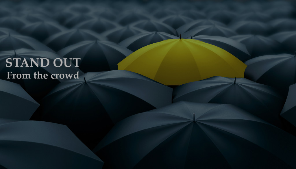
  • Rich But Subtle Animations – as web design is flattening out, websites have started to look more alike. Only way designers are trying to make their sites stand apart from the crowd is through the use of rich, clever and subtle animations.

Source Url:- http://surevin.com/blog/prime-web-design-trends-to-look-forward-to-in-2016-2/